Hey, welcome to another read. I would have said a hand-licking read, but I want you to judge by yourself.
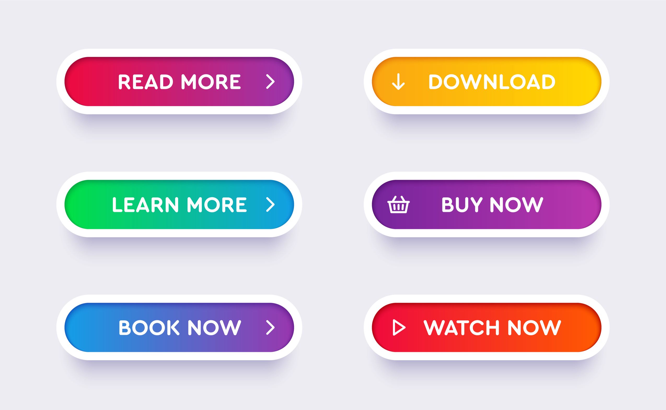
This article is mainly about how you can turn your web page visitors into customers with eye-catching buttons. Yeah, colourful and hand-licking buttons.
You see why I wanted to use hand-licking. But, as I promised, I will still allow you to judge by yourself.
Now, before we dive in, let me wet your mind with this background. It is good to know that being colourful does not only mean bright and shouting colours. Do you get it?
Wait! Let me explain better.
What will be colourful on a dark background or web page, will not appear colourful on a red background. So, the word colourful can also mean a creative use of colours. Now, start to see a webpage with the right use of colours for CTAs—call to action buttons.
How many have you seen in your head already? 🤓
Let's Dive Into The Power of Call To Actions on a Website!
Imagine scrolling through your phone, browsing websites, when suddenly a burst of colour catches your eye. It's not a flashy ad, but a button on a webpage, so inviting you can't help but tap it. That's the power of a well-designed Call to Action (CTA).
Your Silent Salesperson
Think of your CTA as a friendly salesperson on your website. Unlike a real vendor, it can't use its voice to convince visitors to take action. But what it lacks in words, it makes up for in colour! A strategically chosen colour can transform your CTA from a background blur into a vibrant beacon, guiding users towards your desired action, whether it's "Buy Now," "Get a Free Quote," or "Download Now."
The Color Palette of Persuasion
Colours are like the secret language of the web. They have the power to influence emotions and guide user behaviour. Choosing the right colour for your CTA can be the difference between a booming online business and a quiet, empty storefront.
Let's decode the significance of the Rainbow Colours for CTAs

- Red: The Bold Attention Grabber - Picture a ripe Hibiscus flower or a spicy bowl of Efo Riro. Red is a bold choice, perfect for highlighting limited-time offers or CTAs urging immediate action.
- Orange: The Energetic Burst - Think of a juicy mango or the vibrant energy of a Lagos street market. Orange exudes excitement, ideal for "Download Now" or "Get Started" buttons, motivating users to take that first step.
- Yellow: The Beacon of Optimism - Imagine a field of sunflowers swaying in the breeze or the warm glow of sunshine on your skin. Yellow brings a sense of warmth and positivity, perfect for "Learn More" or "Discover Now" CTAs, gently encouraging users to explore further.
- Green: Go Time! Think of the lush greenery after a rainy season or the "go" signal at a race. Green signifies growth and movement, ideal for "Subscribe" or "Start Your Free Trial" CTAs, prompting users to embark on a new journey.
- Blue: Trustworthy Tranquility - Imagine the calming blue of the ocean or the reliability of your favourite pair of jeans. Blue evokes trust and security, ideal for "Contact Us" or "Request a Quote" CTAs, putting users at ease.
- Purple: A Touch of Luxury - Picture the majestic Aso Oke worn by royalty or the elegance of amethyst jewellery. Purple signifies luxury and exclusivity, perfect for "Exclusive Offer" or "Premium Access" CTAs, catering to users seeking a high-end experience.
Finding Your Perfect Colour Match For Call To Action
Remember, the best colour for your CTA isn't just about grabbing attention. It should also complement your brand's overall identity. Think of it like choosing the right fabric for your outfit. A playful website selling handmade crafts might benefit from a bright yellow CTA, while a website offering financial services might opt for a more sophisticated navy blue.
Here are some additional tips to consider:
Contrast is Key: Make sure your CTA colour stands out clearly from the background of your webpage. A high-contrast button is more likely to be noticed.
Test and Refine: Be bold and experiment with different colours! A/B testing allows you to see which colour drives the most clicks for your specific audience.
Keep it Simple: Regarding CTAs, less is often more. Use clear, concise language and avoid overloading your button with text or complex designs.
Unleash the Power of Colour!
By understanding and using the psychology of colour strategically, you can transform your CTAs from silent observers into powerful conversion tools. With this knowledge in hand, you're well on your way to creating web pages that not only look stunning but also convert visitors into loyal customers. So go forth, unleash the power of colour, and make those buttons sing!
Before I wrap up, imagine implementing what you have learnt on food website. What would you have? Actually, that is one niche that plays well with colours. We will talk about the colours that different niches use in designing in the next article.
Thanks for reading. So, what do you think? Is this article hand-licking? 🙂Tell us!
We are open to your questions (use the comment box below) or business consultation session. Reach us on WhatsApp.


jjhdf